

You must log in or register to comment.
That graph is insane
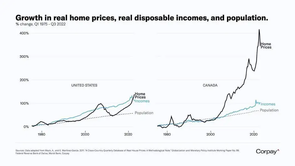
I hate it when the chart doesn’t say what it depicts. I assume those are averages, not median. The average hides that fact that most people’s real income has barely grown in 20 years. All the income growth comes from the top 20% or so, you don’t see that in the average.
This is definitely an average. Top earners dragging up the average makes it a shit number to use in most economical statistics. Median is better for income figures almost always these days.
Still shocking that Canada is this much worse than the US. It’s also horrible here.
